What is the history of the V-series and where does this designation come from?
OPINION:
Cadillacs during hte 30s and 40s were called "series." So, there was the V-8 Series... and there was the "Sixty series" (which was a V-16- ~4k built)... They were all "v-series" cars... Get it?
Also great justification to build a Car called the "cadillac 16" today as a prototype... This is all a throwback to the 1930s era...
Further justification for naming the CTS-V and such the "v-series":
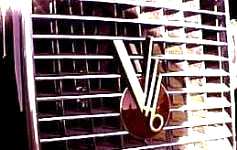
1940- "The identifying feature for all V-8 Cadillacs was once again the grille."
1934- "The grill was Vee shaped and sloping, set into a painted shell."
Articles and official information
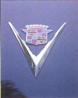
"The name recalls the Cadillac V from the division's glory days in the '50s and is now intended to imply velocity"
"The new V-Series logo both harkens back to Cadillac's rich heritage as a pioneer in high-performance "V" engine technology and also conveys the dynamic posture that will characterize the V-Series models. The new V-shaped logo for V-Series models employs the same colors - black against gold, red, silver and blue, on a platinum background - as the Cadillac division's redesigned "Wreath & Crest" logo.
"While its colors are meant to depict the 'luxury' side of Cadillac, its vertical orientation and its forward-leaning angle to the right are both meant to depict motion and performance," said Kip Wasenko, design director, GM Performance Division, who oversaw the design of the V-Series logo. "This new V-Series logo draws on the proud technological heritage of Cadillac's past emblems, but renders that heritage in a thoroughly modern and sophisticated way."
The use of the "V" designation in Cadillac sales literature dates to the beginning of the brand. V-shaped emblems started to appear on radiator grilles, trunk lids and hub caps in the 1930s, and following World War II, Cadillac's divisional emblem evolved into the well-known "V-and-crest" design which lasted, in one form or another, into the 1960s."
Links
http://www.autoworld.com/apps/news/FullStory.asp?id=2013
http://100megsfree4.com/cadillac/
Oringinal Caddy crest

This site is not affiliated with General Motors or Cadillac. All trademarks are property of their respective owners.
All pages copyright www.cadillacfaq.com.
Donate to keep this site live and ad free Here
Main Page---
List Style FAQ---
Document Library---
Image Library---
Video Library---
Vendor/Mod List---
DealerRank---
V Newsletter---
Other Links
For questions or comments email ctsvett@earthlink.net